
Exploring Data Visualization with Seaborn and ChatGPT
Introduction to Seaborn Visualization in ChatGPT:
Everything you are about to see was entirely created inside the ChatGPT interface. No code was run on my local machine. I uploaded the raw data, ChatGPT received it, processed it, turned it into beautiful visuals, and sent me the link to download the finished file!
Data visualization is a powerful tool that enables data analysts, scientists, and decision-makers to visually represent complex data and draw meaningful insights. When it comes to data visualization in Python, Seaborn stands out as a versatile and user-friendly library that offers a wide range of plotting functions and customization options.
Seaborn is built on top of the popular Matplotlib library and provides a high-level interface for creating informative and aesthetically pleasing statistical graphics. In this blog post, we'll explore the key features of Seaborn and demonstrate how to create compelling visualizations that effectively communicate data-driven stories.
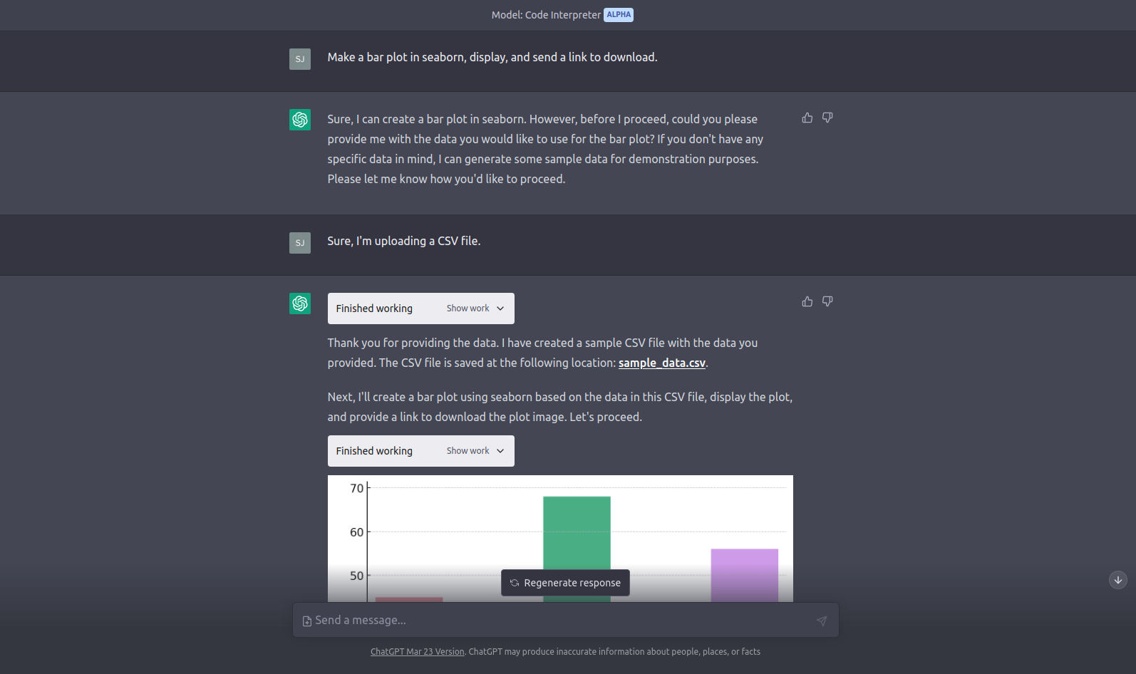
The Humble Bar Plot:
Seaborn stands out as one of the most popular libraries for data visualization in Python, and for good reason—it offers an extensive array of aesthetic options that allow users to create visually stunning graphics. However, the sheer diversity of available options and arguments can be overwhelming to remember. But worry not! With ChatGPT by your side, creating an attractive Seaborn bar plot is a breeze. Simply prompt ChatGPT with a request like, "Use this data to make an attractive bar plot, use a purple color scheme, and label the axes and title," and you'll promptly receive a beautifully crafted bar plot. With ChatGPT, the power of Seaborn's aesthetic capabilities is just a command away!

Visualizing the Iris Dataset: A Beautiful Scatter Plot:
Here's a shape anyone who took a class in data visualization will know well. The tried and true Iris dataset. The Iris dataset is a classic dataset that is commonly used for teaching purposes in data visualization and machine learning. It contains information about iris flowers, including the length and width of their sepals and petals, as well as their species.
While this dataset is included in many packages, I used ChatGPT to write a BeautifulSoup (BS4) script to scrape the data from the UCI Machine Learning Repository at 'https://archive.ics.uci.edu/ml/machine-learning-databases/iris/iris.data' and output it to a CSV file.
Unfortunately, the code that fetches and scrapes the data has to be run on your local machine for now, as ChatGPT does not have internet access in its current state. After scraping the data and uploading the file, I prompted Chat "Using the Seaborn library, turn this data into a stunning scatter plot with a purple color scheme."

Add Background Images in a Pair Plot:
As I wrap up my exploration of basic Seaborn possibilities, I want to highlight a unique way to enhance pair plots. Seaborn offers an array of options to create visually appealing data visualizations, and pair plots are no exception. I've had the chance to craft some beautiful pair plots by manually coding in Python, and I've experimented with different parameters to achieve the desired look.
Never have I considered using a background image. With the help of ChatGPT, I was able to achieve this enhancement with ease. I simply uploaded an image to ChatGPT and gave it the instruction: "Use this image as the background of the pair plot we created. Use a low opacity."

Taking Data Visualization to New Dimensions:
While not directly related to the Seaborn library, I want to tease the next related topic that I am going to cover. Creating 3D plots, and animating them. I asked GPT4 for a wave function that would look visually stunning in a 3D plot (Don't ask me what it is, not my field). Copying this function I used it as a prompt for Code Interpreter. "Turn <wave function> into a visually stunning 3D plot" once I had the plot "Turn this plot into an animated GIF, use 12 frames, rotate the plot 30 degrees each frame". This is just the tip of the iceberg, check out my post on GIFs where I take data visualization into the fourth dimension!


